Saturday, 30 March 2013
Wednesday, 27 March 2013
Webpage

Here is my website homepage. I have also created additional pages on the site alongside the homepage. By scrolling down on the homepage there are also additional features. You can click on the image and it will take you to the site.
Digi Pack
 |
| Front Cover |
 |
| Left Inside |
 |
| Right Inside |
 |
| CD Design to go ontop of right side image |
 |
| Lyric Inset for Left inside |
 |
| Back Cover |
Sunday, 24 March 2013
Evaluation Question 4
How did you use media technologies in the construction and research, planning and evaluation stages?
Saturday, 23 March 2013
Thursday, 14 March 2013
Dog Is Dead Website
WEBPAGE: http://lucybrenner.wix.com/dogisdead
Dog Is Dead - Webiste Home Page
The Home Page for my chosen band Dog Is Dead consists of the same image that I choose for the main cover of the digi-pack. I thought that it was necessary to include this image on the homepage as it is representative mainly of their new video. I also thought it was important not to have a picture of the band and instead a photograph that I had taken in order to represent their style of music of being slightly alternative/ indie pop. I chose to have this image as a banner at the top of each page on the site as it acts as an anchor to the website. The image chosen represents the differences of character/characters through the way in which two meals have been laid out differently. One side/character is neat conveying the character as tidy, could have connotations of being a females set up breakfast or connotations of perfection. The theme of perfection is made evident through the symbolism of a Barbie doll in our music video and therefore the neat side has these connotations. The other plate is messy, with ketchup splattered and crumbs. This could represent the characters state of mind as confused or muddled and the characters personality. Both sides of the image individually represent the character and when the plates are placed next to each other there is a clear difference between the two. However similar to our music video, I have created an image that is open to interpretations. Furthermore I chose to use a continuous colour theme for the whole web page in order to make it look authentic. I decided that the contrast between the white and the black would be an ideal colour scheme as it is simple yet effective. Regarding font type I chose a fairly simple large font type and used this font type throughout the website for continuity of my product. Additionally I chose to have the bands name centralised at the top of the page. I also made the decision of what links I wanted to include on the webpage. These include, The Bands homepage, an about the band page, Gallery, the band's music, Tour and a contact page.
On the homepage I thought it was necessary to include links to the band's social networking sites. These website links on the main homepage helps to showcase the artist’s music and promote their music. I choose to include a live feed from the band's twitter so that even when they are visiting the website they are up to date with the band's activities and if they want to carry on keeping up to date with the band they can then follow them on twitter. There is also a link to sound cloud whereby the viewer can listen to listen to samples of the band's songs they are only teasers making the audience want to hear more and therefore purchase their songs.
I designed the 'about the band page for the band.' I chose to contiue the colour theme and the same design layout on all the pages of the webpage. On this page I have included a small snippet of some band information which includes 'Dog is dead is an indie pop band signed to Atlantic records. Within the band there is Robert Milton (vocals, bass guitar) Rob White (vocls and guitar) Joss Van Wiler (vocals, keyboards, guitar) Laurence cole (vocals, bass guitar) and Daniel Harvey (drums) ' and also a facebook like button to further promote the band through social networking sites.
The Band's Music Page
 The Band's Music page consists of two columns. The first column is the band's top music video and the other colour entitled 'music' is links to their music on soundcloud. This page enables fans to access and sample their music therefore helping to promote their music. As one the top music video I linked the video that I created to help showcases all of the band's products on the website. The links from soundcloud also enable fans to click on the link and visit their whole soundcloud page similar to the videos whereby if they enjoy the videos they can visist the band's youtube channel from just clicking on the video.
Contact Page
 Lastly I chose to design a contact page for the band, where fans are able to email the band along with socia; networking links to enable fans to keep in contact and up to date with the band's news. On this page I chose to include an email template on whereby writting the email is made simple for the fans. All they need to do is write what they want to say and click send without naviagting to another page. I thought this would be a personal touch to the website enabling fans to speak to the band memebers. I dedicded to also include the band's email address next to the email layout. I chose to include the same colour scheme also on this page for continuity of the product.
Dog Is Dead - Webiste Home Page
The Home Page for my chosen band Dog Is Dead consists of the same image that I choose for the main cover of the digi-pack. I thought that it was necessary to include this image on the homepage as it is representative mainly of their new video. I also thought it was important not to have a picture of the band and instead a photograph that I had taken in order to represent their style of music of being slightly alternative/ indie pop. I chose to have this image as a banner at the top of each page on the site as it acts as an anchor to the website. The image chosen represents the differences of character/characters through the way in which two meals have been laid out differently. One side/character is neat conveying the character as tidy, could have connotations of being a females set up breakfast or connotations of perfection. The theme of perfection is made evident through the symbolism of a Barbie doll in our music video and therefore the neat side has these connotations. The other plate is messy, with ketchup splattered and crumbs. This could represent the characters state of mind as confused or muddled and the characters personality. Both sides of the image individually represent the character and when the plates are placed next to each other there is a clear difference between the two. However similar to our music video, I have created an image that is open to interpretations. Furthermore I chose to use a continuous colour theme for the whole web page in order to make it look authentic. I decided that the contrast between the white and the black would be an ideal colour scheme as it is simple yet effective. Regarding font type I chose a fairly simple large font type and used this font type throughout the website for continuity of my product. Additionally I chose to have the bands name centralised at the top of the page. I also made the decision of what links I wanted to include on the webpage. These include, The Bands homepage, an about the band page, Gallery, the band's music, Tour and a contact page.


On the homepage I thought it was necessary to include links to the band's social networking sites. These website links on the main homepage helps to showcase the artist’s music and promote their music. I choose to include a live feed from the band's twitter so that even when they are visiting the website they are up to date with the band's activities and if they want to carry on keeping up to date with the band they can then follow them on twitter. There is also a link to sound cloud whereby the viewer can listen to listen to samples of the band's songs they are only teasers making the audience want to hear more and therefore purchase their songs.
The Main Home Page also contains
a blog/ news feed of the band's upcoming events
and his involvement in the music industry, competitions, new videos and news
about the band. This helps to further updates fans about the band's latest
updates, keeping them involved in his music. As a recent blog post on the page,
I have include a link to the new video that we have created for the band with
the post captioned 'watch our video for our new single 'Two Devils.' Another
post I included on the news feed is a link to the bands facebook page, if the
fans would like to see how the video was made they are able to look at the
bands facebook. For each most/ where it is necessary I have included a 'read
more' button so that if the post is of interest to the fan they are able to
read more.

About The Band Page 
I designed the 'about the band page for the band.' I chose to contiue the colour theme and the same design layout on all the pages of the webpage. On this page I have included a small snippet of some band information which includes 'Dog is dead is an indie pop band signed to Atlantic records. Within the band there is Robert Milton (vocals, bass guitar) Rob White (vocls and guitar) Joss Van Wiler (vocals, keyboards, guitar) Laurence cole (vocals, bass guitar) and Daniel Harvey (drums) ' and also a facebook like button to further promote the band through social networking sites.
The Band's Music Page
 The Band's Music page consists of two columns. The first column is the band's top music video and the other colour entitled 'music' is links to their music on soundcloud. This page enables fans to access and sample their music therefore helping to promote their music. As one the top music video I linked the video that I created to help showcases all of the band's products on the website. The links from soundcloud also enable fans to click on the link and visit their whole soundcloud page similar to the videos whereby if they enjoy the videos they can visist the band's youtube channel from just clicking on the video.
 Contact Page
 Lastly I chose to design a contact page for the band, where fans are able to email the band along with socia; networking links to enable fans to keep in contact and up to date with the band's news. On this page I chose to include an email template on whereby writting the email is made simple for the fans. All they need to do is write what they want to say and click send without naviagting to another page. I thought this would be a personal touch to the website enabling fans to speak to the band memebers. I dedicded to also include the band's email address next to the email layout. I chose to include the same colour scheme also on this page for continuity of the product.
 Wednesday, 13 March 2013
Website Update
Today I signed up to ‘Wix’ website building site. I will be using this website to create the
website for my chosen band ‘dog is dead.’ Today I decided on a template that I
wanted to use in order to begin building my webpage. After researching into other
artist's webpages, I came up with a checklist of what I wanted to include
on my homepage.
Checklist:
Same image as digipack at top of homepage
Band Title
Navigation bar
Social networking links, Twitter, sound cloud, Youtube. These website links on the main homepage helps to showcase the artist’s music and promote the bands music.
Live News Feed
New Video
Same image as digipack at top of homepage
Band Title
Navigation bar
Social networking links, Twitter, sound cloud, Youtube. These website links on the main homepage helps to showcase the artist’s music and promote the bands music.
Live News Feed
New Video
Wednesday, 6 February 2013
Indie Website Analysis
Indie webspage analysis from lucybb19
I looked at two indie band's webpages to explore how indie artists have presented themselves on their homepage. By looking at two I was able to compare how two indie bands have showcased their music differently despite being part of the same genre.
I looked at two indie band's webpages to explore how indie artists have presented themselves on their homepage. By looking at two I was able to compare how two indie bands have showcased their music differently despite being part of the same genre.
Friday, 25 January 2013
Music Video Final And Update
Offical and final version of my music video.
Update:
We have changed ending from shot of boy knocking at the door to now have the shot of the dolls head being flicked away. We choose to change this ending from our first draft in order to combine and finalise the two narratives that are prevalent throughout the music video. Consequently, we choose to have the shot of the boy's head looking up as the penultimate shot and then followed by the final shot of the dolls head being flicked away. We thought that this was ultimately more effective than our original idea as it drew the both storylines to a close at once.

Sunday, 20 January 2013
Evaluation Question 1
In which ways does your
media product use, develop or challenge forms and conventions of real media
products?
Avante Guarde Development in our music video:
In the music video we have
developed ideas from the avante guarde movement, in particular Surrealism. Surrealism began in the early 1920’s and its
works demonstrate the elements of
surprise and unexpected
juxtapositions. For my music video we have demonstrated the unexpected juxtaposition of a Barbie doll, which is symbolic of perfection, being destroyed and
broken. Surrealism has been demonstrated by the way in which the audience
would not expect these two ideas to be combined together. We have also
demonstrated the Cinema Vertie
style. This movement focused on
observation through the use of a hand
held camera. The style
itself is a style of documentary filming. Our video therefore resembles a
almost ‘fly on the wall’ effect reflecting that the actions of the boy and
young girl are both naturalistic. By using a Cinema vertie effect for our music
video we were able to demonstrate a slight
reality by making part
of the narrative appear unrehearsed by a slightly shaky camera such as the
filming of the post it notes have purposely been handheld.
I have conformed to many of the indie pop genre's conventions for the production of my digipack. I have included the track listing, with genre specific additional songs such as an acoustic version and also an extended version of the song 'Two Deviils'. Additionally I have developed the idea of creating an image that is representative of the band. Most indie pop bands have an image on their digipack cover that is representative of the band's style of music and therefore I choose to create an image that incorporated the main themes for our music video. I have also included copyright which is on every product and therefore I thought it was important to include this on mine too. However the lexical choices that I decided on for the copyright sentence are specific to the genre and appear almost alarming with the lexical choice of 'prohibited.' This therefore continues an eerie mood for all three products. For my website I have include social networking links such as for twitter and facebook which is a common feature of many webpage. I have also included oppurtunites to sample the bands music such as via soundcloud and youtube which therefore help to showcase the bands music on the website.
Wednesday, 2 January 2013
Tuesday, 1 January 2013
Digi Pack Final
For my digipack cover I wanted to convey a narrative which would be represented through the images I have used on the front and back of the cover. Moreover I wanted to convey the same theme which is evident in my music video on my digipack for the band. The theme I choose to represent on my digipack, was conveying the division of character and also the characters transition throughout the music video. I therefore choose to represent this theme through a meal. I wanted to demonstrate separate characterisation of one character by the way in which two meals have been laid out differently. I wanted to then show the transition of character by taking advantage of the front and back of the digipack. I have therefore shown the transition of character from the commencement of the meal on the front cover and then the end of the meal on the back cover. For both the front and back cover of the digipack I have used a red colour tone to correspond with the red filters that are prevalent throughout our music video for two devils. The use of the red filters in our music video and then the red colour tone on our digi pack is alerting and signifies danger. This danger could be significant of the danger the girl has caused to him emotionally, the danger of the male’s characters transition or alternatively the danger of the situation. Similar to my music video, the decision to have an narrative behind my digipack enables different interpretations but also shows a continuous theme between the music video and the digipack which I felt was important to represent the band as 'indie'. For all four sides of my digipack I have used a font on Coral Photo paint called Avante Guarde. When researching my chosen band 'dog is dead' I discovered that this font type was a similar font type that the band use on the majority of their products. I therefore wanted to represent the band in the way that is typical to them. Furthermore, the bands name on most of their products is written in lower case and I therefore wanted to do the same on my digipack.
 |
| Front |
- This is the front cover for my digipack. For the cover I have used an image that I took of a meal representing two characters. The characterisation can be interpreted as a relationship or an individual character. Nonetheless I wanted to show the differences of a character/characters through the way in which two meals have been laid out differently. One side/character is neat conveying the character as tidy, could have connotations of being a females set up breakfast or connotations of perfection. The theme of perfection is made evident through the symbolism of a barbie doll in our music video and therefore the neat side has these connotations. The other plate is messy, with ketchup splattered and crumbs. This could represent the characters state of mind as confused or muddled and the characters personality. Both sides of the image individually represent the character and when the plates are placed next to each other their is a clear difference between the two. Depending on how the image is looked at the two plates can show the transition of one character which is also evident in our music video or the separation of two characters. Similar to our music video, I have created an image that is open to interpretations. Over the original image I have used a red colour tone. The red colour tone that I have used correspond with the use of red filters that are prevalent throughout our music video for 'two devils'. The use of the red filters in our music video and then the red colour tone on my digi pack is alerting and signifies danger. This danger could be significant of the danger the girl has caused to him emotionally, the danger of the male’s characters transition or alternatively the danger of the situation. For the front cover it was important to have the bands name and also the singles name on the front cover. I have positioned the bands name and single title in the left hand corner of the image. It was important that the bands name was a larger font size to the singles name in order to showcase the band through this product. Regarding the singles name 'Two Devils' I have added a perspective to this writing to show the transition through distance which could represent the transition of a character overtime.
This is the inside left side of my digipack- I choose to take a feature of my original image (the glass of orange juice and have this displayed on a black background. This therefore shows a continuous theme throughout my digipack.
This is the right inside of my digipack.
- This is the back cover for my digi pack. For the back cover I wanted to have a continuous theme throughout the whole digi pack and therefore chose a continuation to the image on the front cover. Both the front and back image when seen together show the transition of the character which is made evident in the commencement of the meal and then at the end of the meal. The way in which both plates are laid out correspond with the front cover and demonstrate how the meals are finished differently, depending on the character. Similarly to the front cover, I have used a red colour tone and increased the contrast, to match the front cover and appear alerting fans that would perhaps by this cover. The colour red is significant of danger which is a total contrast to the idea of a basic meal image. The decision to use a red tone enabled me to amplify further differences on the cover and to also correspond with the use of red filters that are prevalent throughout our music video for 'two devils'. Moreover I have displayed, the track listing on the back cover, which is common on most album covers and have included alongside the original, an acoustic, extended and instrumental version. These variations to the original, particularly an accoustic version are common of the genre and therefore I thought it was important to use these variations to show 'dog is dead' as an indie band. I have used a consistent font type for all of the writing on the album cover and chose a white font, to contrast with the dark background. I have also added the bands website link and repeated the band’s name and the singles title. I also thought it was necessary to add a sentence regarding copyright.
|
| Back Cover |
 |
| Inside Left Side |
This is the inside left side of my digipack- I choose to take a feature of my original image (the glass of orange juice and have this displayed on a black background. This therefore shows a continuous theme throughout my digipack.

The lyric insert has the same front and back as the digipack covers front and back. The pages which contain the lyrics also have the same colour theme as the rest of the digipack with a red background and white writing. I therefore wanted the lyric insert to appear as a smaller version of the digipack, following the same design but instead containing lyrics. I have also used the same font and colour toning in order to keep the continuty of the product. 
 |
Inside Right  |
This is the right inside of my digipack.
Sunday, 23 December 2012
Analysis Of An Indie DigiPack
I looked at an indie Band called 'Bombay Bicycle Club' to explore the ways in which an indie band has represented themselves on their album cover:
Front:
Inside left side:

.jpg) Inside right side:
Inside right side:
Back:
Front:
- Image is eyecatching, portrays a narrative
- The band is absent from the cover and are instead represented through an image which is common to the indie genre.
- Image is black and white, contrast to the blue writing
- The logo of 'Bombay Bicycle Club' is directly centre of the album
- Includes a blue sticker with online and additional information
- Consitent colour theme throughout entire album, Black and white images and then blue writting.
.jpg)
Inside left side:

- Writing on the inside 'Insert this disc into your computer to access an exclusive session and films or go to www.bombaybicyleclubmusic.com for further info'. Provides a website link for fans helps to further promotes the band and further showcase their music
- Image, is abstract, continued black and white theme, gives a dated effect to the image.
.jpg) Inside right side:
Inside right side:- Shows a similar image to the front cover
- Plastic holder for CD, placed over back image, can therefore only see the crowds in the image, perhaps representing the fans
- CD design contains a segment of the front cover, of an indivudal, high contrast and predominantly more black over white colour for the image which contrasts with the white disc. CD also contains same logo of 'Bombay Bicyle Club' which is used on the front cover. CD also has the album covers name 'I had the blues but I shook them loose'
- Suprisingly the writting is not verticle
Back:
- Track listing on left hand side in white
- Bands name as part of the image, appears smudged, looks like a sticker appears to mark the property of the album as belonging to the band
- Again, black and white image and then blue writing
- Provides website link again and link to the bands myspace
- Record Company label mentioned
- Barcode in top centre

Saturday, 15 December 2012
Wednesday, 12 December 2012
Audience Questionnaire Question 10
What key themes have you picked up from the music video?
Internal conflict, let downs
Sadness, hope, love
Disappointment
Love, heartbreak, unrequited love, obsession
Unrequited love
Distress, anger
Obsession
Reflection, hope, loneliness, distressed
How strong a feeling of love can be
Obsession
Obsession
Love, dating
Any other comments?
Very good video
Saw effort made and loved variety of scenes
Very enjoyable
Very good and well presented
Really good video, great variety of shots, interesting to watch
Very unique and convincing that the man was genuinely upset.
It was very well presented
As a result of our Questionnaire for our music video, we were happy that our audience understood the main story line and also picked up on the key themes that we were trying to convey such as disappointment, obsession and loneliness. Our results suggests that many favored the barbie dolls idea in reflecting the boys change of mood.
Internal conflict, let downs
Sadness, hope, love
Disappointment
Love, heartbreak, unrequited love, obsession
Unrequited love
Distress, anger
Obsession
Reflection, hope, loneliness, distressed
How strong a feeling of love can be
Obsession
Obsession
Love, dating
Very good video
Saw effort made and loved variety of scenes
Very enjoyable
Very good and well presented
Really good video, great variety of shots, interesting to watch
Very unique and convincing that the man was genuinely upset.
It was very well presented
As a result of our Questionnaire for our music video, we were happy that our audience understood the main story line and also picked up on the key themes that we were trying to convey such as disappointment, obsession and loneliness. Our results suggests that many favored the barbie dolls idea in reflecting the boys change of mood.
Audience Questionnaire Question 9
Do you think that the suburban shots of the boy walking down the
street are a cliché? Do you think it should be taken out?
No – they add to the suspense
No – it was interesting and showed the emotions he felt
No, fine
Undecided, I like him sitting at the door though – think it should end there
Didn’t look good quality
No – I liked the shots
Maybe cut some of it out, make it shorter
They worked well but I thought there a tiny bit too much
No, I like them. Evocative
It maybe lasted for slightly too long
No they are effective because it shows how far away he is going
No, they worked well with the story line
No, it is about a middle class boy so it should be suburban
Audience Questionnaire Question 8
Would you watch more of these types of videos by this artist if they
were like this?
Maybe
Yes as it was interesting story
Yes
Possibly
Maybe – although don’t like the sound/style of music
Yes, the storyline was interesting and reflected the song
Yes
Yes – it’s very dramatic
Yes, definitely
Yes, I was very entertained
Yes
Yes
Definitely yes, it was very effective
Yes 100%
When showing others our music video before today, we were told that the suburban shots of the boy walking down the street were cliche and therefore we decided to include a question on this in order to see what others thought about the idea.
Audience Questionnaire Question 7
What is your favourite part of the video?
The end provides a cliff-hanger, entertaining
The shots with the dolls
The clock
The mix between the Barbie doll being broken apart and him feeling broken
Love the dolls and tea set
Doll house corresponding to actor
The end is very dramatic and effective
Sitting watching the door
Using the dolls to resemble a voodoo doll effect and the red lighting gave a sinister feel
The angles at the end
When the man goes crazy
How he broke the Barbie doll showing his feelings breaking
The way it cuts on the beat in the room when he’s changing
The use of dolls which are constantly being used in comparison with the human story line
When he mushes up the cake
Audience Questionnaire Question 6
Do you think the props and location are convincing in relation to
the narrative? Explain
Yes
Yes – explains emotions
Location too ‘posh’, flat better for young single man
Yes they portray the feelings that the character seems to be going through
Love the dolls and tea set
Definitely the doll house – was great
The location is good, I am not sure about the props
Yes the post it notes showed his obsession
Liked props very much and thought they were appropriately suited
Yes, very realistic
Yes, the link with the puppets is very good
Yes the props used to show the anger (Barbie) resembles the girl. The cake when he destroyed it and the photo
Yes
Yes
Yes, very good
Yes
Yes – explains emotions
Location too ‘posh’, flat better for young single man
Yes they portray the feelings that the character seems to be going through
Love the dolls and tea set
Definitely the doll house – was great
The location is good, I am not sure about the props
Yes the post it notes showed his obsession
Liked props very much and thought they were appropriately suited
Yes, very realistic
Yes, the link with the puppets is very good
Yes the props used to show the anger (Barbie) resembles the girl. The cake when he destroyed it and the photo
Yes
Yes
Yes, very good
Audience Questionnaire Question 5
Please note three words you would link to the character in our video
Insecure, obsessive, controlling
Emotional, love, upset
Nervous, meticulous, angry
Obsessed, angry, possessive
Lonely, mercurial, needy
Obsessive, needy, alone
Upset, angry, disappointed
Obsessive, angry, lonely
Obsessive, committed, sad
Distressed, lonely, aggravated
Distressed, lost, lonely
Anger, betrayal, lonely
Stalker, angry
Creepy, obsessed, angry
Crazy, OCD
Audience Questionnaire Question 4
Are there parts of the narrative that you think don’t belong in our
video? Anything we should take out?
No – some not wholly relevant
No
Too much happening maybe. Also, too angry when stood up
The toy dolls
No
None
No
Him about to climb over the balcony
None
No – some not wholly relevant
No
Too much happening maybe. Also, too angry when stood up
The toy dolls
No
None
No
Him about to climb over the balcony
None
Audience Questionnaire Question 3
Do you think the narrative corresponds with the lyrics? Explain
Yes – links up
Yes – tells similar story
Couldn’t make out the lyrics
The video suggests it was a first date but the lyrics suggested a broken love. Regardless he still has a broken heart
Couldn’t hear/understand the lyrics
Not sure – the “sound” of it does (tone). Couldn’t hear the lyrics
Yes – the lyrics are sad and this corresponds with the disappointment of the protagonist. However I couldn’t hear all of the lyrics
Yes, as they showed his anger and frustration
I didn’t really hear the words very well but it worked well with the tune and rhythm
Yes, they went well
Yes, because the lyrics are moody and show anger
Yes – works very well
I didn’t really listen to the lyrics but the music was in good time
Yes definitely
Concerned with the idea that everyone would think that our all narrative would not work for our music video we wanted to ensure that our auidence also liked this and therefore we asked the audience if they thought the narrative corresponds with the lyrics to ensure we had that link. All of our responses were yes suggesting that our storyline amplified the meaning of the song and presented a deeper layer to the song that would perhaps not have been picked up from hearing the song alone.
Audience Questionnaire Question 2
 We felt it was important to ask our audience if there were any shots which they did not like. We thought that they could perhaps not like certain shots because they may think it does not fit the storyline. The results we recived which we have particularly taken into consideration is to cut down the walking outside scene. We were also warned by our teacher about this and therefore wanted to see if others did'nt like this shot either.
 Are there any shots you don’t like? Please explain
No
No
Dressing scene. Falling over etc. I would have shot it sequentially so that he was only fully dressed at end of scene
No they built up the suspense and there was a good contrast and variety of shots
Some very effective images, perhaps too many iconic/memorable shots
The shots in the street aren’t the best quality
The toy dolls – perhaps it is a bit dark
Cut some of the walking down the road out
I loved all of it
Maybe too long with walking down the road but even that was alright
Where he is making cake
The first shot of him sitting looking at the door – too bright
I really loved all of it
The one in the park, too much light on the actor
As a whole, the feedback, appears positive although one of the participants suggested that the toy doll scenes are perhaps too dark however we wanted this like this to contrast with the previous scenes of the male and also create an eerie mood.
Digi Pack Front Cover Ideas
 |
| Andy Warhol's |

For an inital idea I wanted to experiement with patterning my image to create differences in this way. I therefore duplicated my image so that I had 4 of the origianl and presented the image in a similar style to Andy Warhol. I then boosted the contrasat to each image which also sharpened the colour and then added a colour tone too each image. After reaching this stage I decided that duplicate images made the cover look too crowded, however I finished exploring ideas eventhough I knew I did not want to use this anymore for my cover. As the image is too crowded, a concern I faced was deciding where to have the writting of the band and song name which is vital to include.
 For my second idea I therefore knew that a single image would be more effective. Additionally I added a red colour tone to the image to correspond with the red filters we had used in our music video to alert danger. Additionally I used the Avante Guarde font and wrote 'dog is dead' how the band write it themselves on most of their products in lower case. I also added a perspective to the writting of 'Two devils' to also show a transition through distance. This is therefore the image I will be using for my front digipack cover. The image I took is also effective in portraying the duplicity of the character through presenting two different states to a way in which a meal is eaten. After finishing this idea, my back cover came to mind. I wanted to show the end of the meal with both plates empty but left in two different states to further depict the characters transition.
 Friday, 7 December 2012
Audience Questionnaire Question 1
Today for our Questionnaire we asked 9 Females 6 Male.
Firstly we wanted to ask our audience to briefly describe what happens in our music video so that we were certain that the story-line is understood. From our results it is evident that everyone picked up on the key idea that we were trying to convey. Here are the responses we recieved:
Can you briefly describe what happens in our music video?
Guy has an obsession with a girl who is coming over supposedly but doesn’t turn up
The boy is getting ready for date, girl doesn’t come, he gets angry and starts breaking things and then goes to her house
Boy makes date with girl, looks for her but she fails to turn up. He goes to find her
The girl stands the boy up. He was very angry as he was obsessed with her
Man is expecting date excitedly – he’s obsessed perhaps – and is stood up and heartbroken
A boy is wanting to meet up with girl, but love seems unrequited – stands him up
Preparing a meal, getting ready for a dinner. The protagonist is angered by the fact his guest doesn’t come – he goes to house of guest
A boy obsessed with a girl who has no interest in him as she stands him up
Man gets stood up for date with girl he stalks so gets upset and angry, ruins the cake, tears down her picture and seeks her out at her house.
Girl doesn’t show up to date
Puppets represent what happens in real life. The guy is being stood up and so he goes crazy
A boy obsessed with a girl who left him and stood him up
Man/stalker of woman. She doesn’t turn up for dinner, he’s angry and goes to her house
A man gets stood up for a date and gets so angry/upset that he tries to kill himself
Girl doesn’t turn up for a date and the man goes crazy
As a result it is therefore clear that our aim was achieved and it appears that everyone picked up on the characters clear character transition as a result of his date not turning up and his somewhat obession with her demonstrated by the mise en scene. We therefore will not be needing to change any areas to our narrative.
Choosing Font Type For Digi Pack And Website

Dog is dead font type:
For my Album cover I desire to use a similar font style, to the way in which my chosen band uses for the majority of their products. I discovered a similar font to their style on Coral photo paint called 'Avante Guard' and therefore this is the font that I intend to use for my digipack. Furthermore, the bands name is almost always written in lowercase for most of their products and therefore I intend to do the same for my website and digipack.
Thursday, 6 December 2012
Monday, 3 December 2012
Advertising For Students To Watch Our Music Video
 The deadline to finish the editing of our music video, before Chirstmas is approaching! We intend to show our video to students in the sixth form this Thursday, (6th December.) We have prepared a questionnaire in order to gather audience feedback and to see if there is anything in particular that our audience doesn’t enjoy in our video. In order to ensure that people will come to our feedback session, we designed a poster and placed the poster in certain areas around the school.
Wednesday, 28 November 2012
First Idea For Digi Pack Cover

Saturday, 24 November 2012
Photo Shoot For Digi Pack and Webpage
Today I took images that I could potentially use for my digipak and website. My aim for this photo shoot was to show the duplicity of our character in our music video. Additionally I wanted to depict his split state of mind, through his actions in the video and represent this in my photo shoot. I therefore wanted to show the characters duplicity through the use of food. I decided to have one side on the table laid out neat in contrast to the other side which was messily laid out. I therefore wanted to achieve a contrast between the two sides of the image thus presenting the characters two different states which are evident in the video. Furthermore, other songs on the album contain lyrics of social concern and relationships and therefore I decided that the image could have other connotations such as the relationship of two characters shown by the two sides of the image. I tried the image with numerous meals/snacks for experimentation however my favorite is the image of the toast and ketchup, with the glass of orange juice which undoubtedly demonstrates my main objective for the photo shoot. This image of the toast shows a simple meal but the division between the two thus emphasising the split of his character but also the divisions in a relationship. Additionally I choose to shoot my images on a black background in order to contrast these objects to the background. Furthermore, the black colour is fairly neutral acting as a base for these images. I have also used white plates and bowls for these images to contrast with the black background to further convey differences and opposites. Furthermore, I wanted to show the differences of a character by having two sperate sides of the image therefore emphasing a clear split. I also wanted show the theme of relationships and that relationships can have their differences. Lastly I took an image of the end of the meal which I consider to have on the back of the album to show the characters transition.
 |
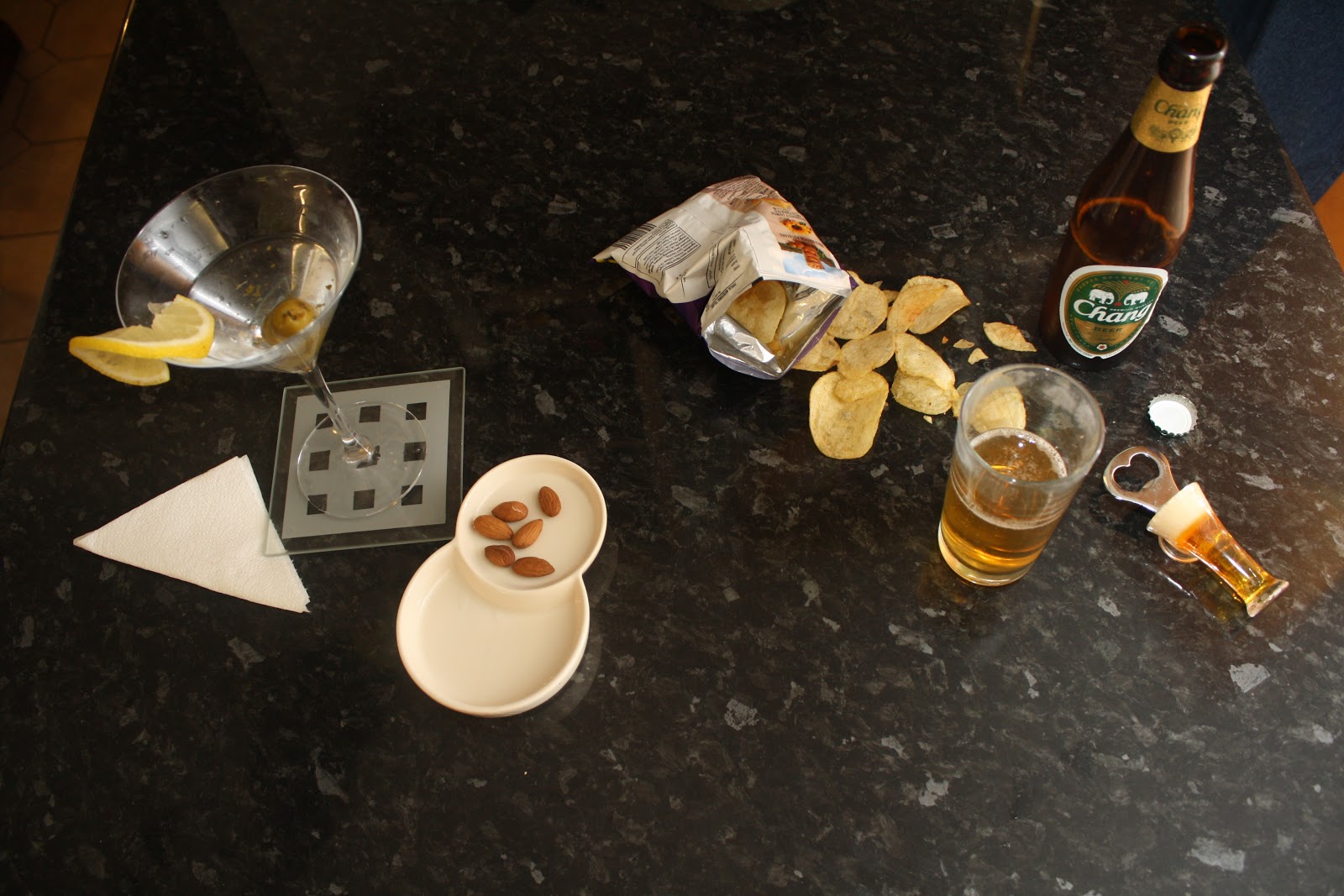
| Cocktail/Beer. For this image I have arranged half of the image laid out with a packet of crisps poured open, along with a beer which is seen as a casual drink therefore further emphasing the division between the two sides of the image. For the other side of the image I have arranged a cocktail and nuts which are seen typical more classy compared to a beer and therefore I chose to show the division of a character through these two states. |
 |
| Neat and Messy. For this image I arranged the table with a easy, snack type meal in order to represent the division of one character. Again half of the image is neat whereas the other side has crumbs everywhere. This was just a starting for exploring ways in how to show a split of character through meals and I have later developed the idea, to have a drink involved in the image too. |
 |
| For this image I used a classy cocktail glass in comparision to a beer to present difference of character in this way. The side of the image with the cocktail glass is elecgantly laid out with a neatly folded napkin and some nuts. In comparision, the crisps are displayed spilled carelessly on the table. |
 |
| My Favorite Image! This image is my favourite one from the shoot as i think that it clearly represents the division of character and achieves the aims for this shoot. I have developed my idea from just the use of toast to involving a glass of orange juice too. However the neat side has the orange juice in a wine class and has a slice of orange placed elegantly on the side of the glass. On the other side of the image the orange peels are messy and ketchup is over the table. This image therefore clearly depicts a division of character conveying a clear difference between the two sides of the image. |
 |
| The Division Of Character. Again, this image depicts the division of character and the black background contrasts with the white plates further demonstrating opposites and differences for the image. |
 |
| Breakfast Differences. I used white mugs and white bowl to contrast with the black background. I choose to use cereal with honey dribbled round the bowl and milk splashed on the side. In contrast the bowl on the other side of the image is neat and has a clean surface area around the bowl and the mug. |


 |
| For these two images, I wanted to present the difference in character by showing the end of the meal, one plate is finished neatly wheres the other plate is covered in crumbs. I was thinking to perhaps have this image on the back cover to demonstrate the end of the meal and the transition of the character. |

Website Analysis
James Morrison Site
Social networking/Digital Mediums:
- Follow James Morrison’s Twitter account
- Fan club on Facebook
- YouTube Channel
- Sound cloud
- Videos
These website links on the main homepage helps to showcase
the artist’s music and promote the music. Furthermore the website enables the viewer
access to James Morrison’s YouTube channel where they can sample and purchase
his music and also sure his music through blogging. All of these interactive opportunities
help to promote the artists music. There is also a link to sound cloud whereby
the viewer can listen to listen to samples of his songs they are only teasers
making the audience want to hear more and therefore purchase his songs. Furthermore, there is the opportunity to log
into your Facebook account or Twitter account where by most of the news items
on his websites are connected to these social mediums. Through this there is a
chance to instantly share and promote his music on these accounts!
News:
The site contains a blog of James Morrison’s upcoming events
and his involvement in the music industry, including the announcement of the
date that he will be performing in Australia. This further updates fans on
James Morrison’s latest updates, keeping them involved in his music. There is also additional information about
James Morrison, with photographs. Photographs of James Morrison are prevalent
throughout his website, acting as an anchor to the website.
Purchasing:
Access to
James Morrison's official store opens in a new tab. Fans are still able to
listen to his music on the official website whilst navigating around his store
in a separate tab thus helping to promote the artist’s music.
- Buy branded clothing such as Broken Strings T-shirt
- James Morrison Poster
- Slave to the Music grey hoodie
- Each product corresponds with a different song of his
- The Awakening CD
- Special Offers
- Tickets
Overall, James Morrison's Website showcases his music particularly through digital media. The role of digital media is therefore vital in production and distribution of his music products. Socail networking plays a huge role on the website, allowing fans, to buy and share his music through these sites, thus promoting his music further. Additonally, Fans are able to download, sample and purchase his music on the Website.
Subscribe to:
Comments (Atom)