Today I took images that I could potentially use for my digipak and website. My aim for this photo shoot was to show the duplicity of our character in our music video. Additionally I wanted to depict his split state of mind, through his actions in the video and represent this in my photo shoot. I therefore wanted to show the characters duplicity through the use of food. I decided to have one side on the table laid out neat in contrast to the other side which was messily laid out. I therefore wanted to achieve a contrast between the two sides of the image thus presenting the characters two different states which are evident in the video. Furthermore, other songs on the album contain lyrics of social concern and relationships and therefore I decided that the image could have other connotations such as the relationship of two characters shown by the two sides of the image. I tried the image with numerous meals/snacks for experimentation however my favorite is the image of the toast and ketchup, with the glass of orange juice which undoubtedly demonstrates my main objective for the photo shoot. This image of the toast shows a simple meal but the division between the two thus emphasising the split of his character but also the divisions in a relationship. Additionally I choose to shoot my images on a black background in order to contrast these objects to the background. Furthermore, the black colour is fairly neutral acting as a base for these images. I have also used white plates and bowls for these images to contrast with the black background to further convey differences and opposites. Furthermore, I wanted to show the differences of a character by having two sperate sides of the image therefore emphasing a clear split. I also wanted show the theme of relationships and that relationships can have their differences. Lastly I took an image of the end of the meal which I consider to have on the back of the album to show the characters transition.
 |
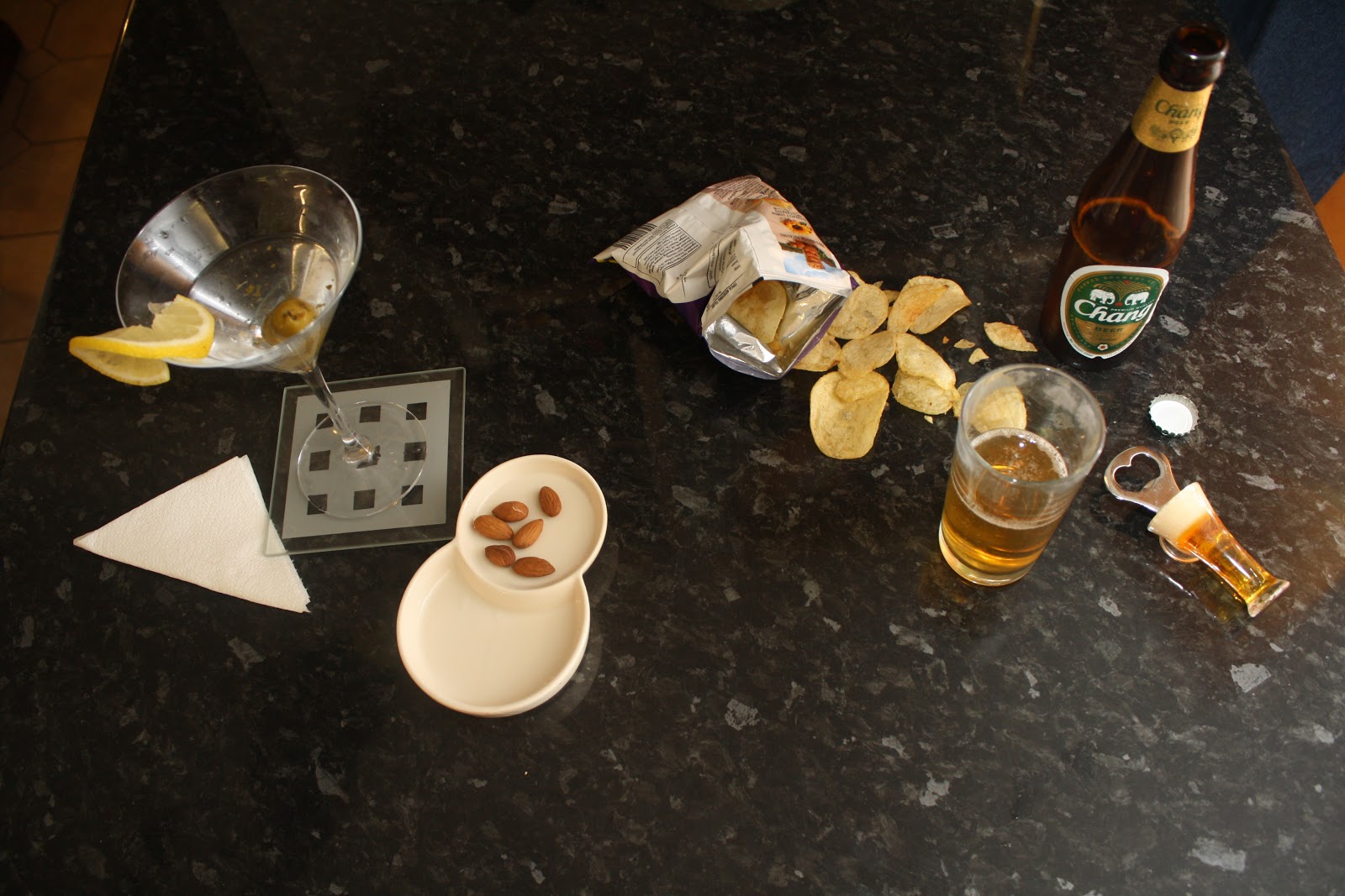
| Cocktail/Beer. For this image I have arranged half of the image laid out with a packet of crisps poured open, along with a beer which is seen as a casual drink therefore further emphasing the division between the two sides of the image. For the other side of the image I have arranged a cocktail and nuts which are seen typical more classy compared to a beer and therefore I chose to show the division of a character through these two states. |
 |
| Neat and Messy. For this image I arranged the table with a easy, snack type meal in order to represent the division of one character. Again half of the image is neat whereas the other side has crumbs everywhere. This was just a starting for exploring ways in how to show a split of character through meals and I have later developed the idea, to have a drink involved in the image too. |
 |
| For this image I used a classy cocktail glass in comparision to a beer to present difference of character in this way. The side of the image with the cocktail glass is elecgantly laid out with a neatly folded napkin and some nuts. In comparision, the crisps are displayed spilled carelessly on the table. |
 |
| My Favorite Image! This image is my favourite one from the shoot as i think that it clearly represents the division of character and achieves the aims for this shoot. I have developed my idea from just the use of toast to involving a glass of orange juice too. However the neat side has the orange juice in a wine class and has a slice of orange placed elegantly on the side of the glass. On the other side of the image the orange peels are messy and ketchup is over the table. This image therefore clearly depicts a division of character conveying a clear difference between the two sides of the image. |
 |
| The Division Of Character. Again, this image depicts the division of character and the black background contrasts with the white plates further demonstrating opposites and differences for the image. |
 |
| Breakfast Differences. I used white mugs and white bowl to contrast with the black background. I choose to use cereal with honey dribbled round the bowl and milk splashed on the side. In contrast the bowl on the other side of the image is neat and has a clean surface area around the bowl and the mug. |

 |
| For these two images, I wanted to present the difference in character by showing the end of the meal, one plate is finished neatly wheres the other plate is covered in crumbs. I was thinking to perhaps have this image on the back cover to demonstrate the end of the meal and the transition of the character. |


No comments:
Post a Comment
Note: only a member of this blog may post a comment.