
Wednesday, 28 November 2012
First Idea For Digi Pack Cover
Saturday, 24 November 2012
Photo Shoot For Digi Pack and Webpage
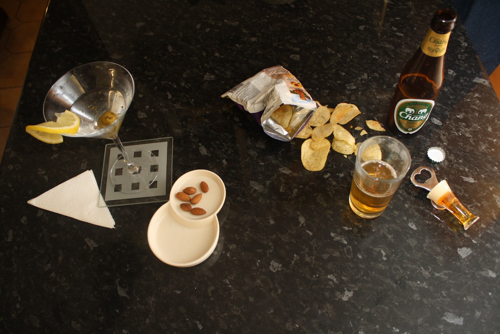
Today I took images that I could potentially use for my digipak and website. My aim for this photo shoot was to show the duplicity of our character in our music video. Additionally I wanted to depict his split state of mind, through his actions in the video and represent this in my photo shoot. I therefore wanted to show the characters duplicity through the use of food. I decided to have one side on the table laid out neat in contrast to the other side which was messily laid out. I therefore wanted to achieve a contrast between the two sides of the image thus presenting the characters two different states which are evident in the video. Furthermore, other songs on the album contain lyrics of social concern and relationships and therefore I decided that the image could have other connotations such as the relationship of two characters shown by the two sides of the image. I tried the image with numerous meals/snacks for experimentation however my favorite is the image of the toast and ketchup, with the glass of orange juice which undoubtedly demonstrates my main objective for the photo shoot. This image of the toast shows a simple meal but the division between the two thus emphasising the split of his character but also the divisions in a relationship. Additionally I choose to shoot my images on a black background in order to contrast these objects to the background. Furthermore, the black colour is fairly neutral acting as a base for these images. I have also used white plates and bowls for these images to contrast with the black background to further convey differences and opposites. Furthermore, I wanted to show the differences of a character by having two sperate sides of the image therefore emphasing a clear split. I also wanted show the theme of relationships and that relationships can have their differences. Lastly I took an image of the end of the meal which I consider to have on the back of the album to show the characters transition.
 |
| Cocktail/Beer. For this image I have arranged half of the image laid out with a packet of crisps poured open, along with a beer which is seen as a casual drink therefore further emphasing the division between the two sides of the image. For the other side of the image I have arranged a cocktail and nuts which are seen typical more classy compared to a beer and therefore I chose to show the division of a character through these two states. |
 |
| Neat and Messy. For this image I arranged the table with a easy, snack type meal in order to represent the division of one character. Again half of the image is neat whereas the other side has crumbs everywhere. This was just a starting for exploring ways in how to show a split of character through meals and I have later developed the idea, to have a drink involved in the image too. |
 |
| For this image I used a classy cocktail glass in comparision to a beer to present difference of character in this way. The side of the image with the cocktail glass is elecgantly laid out with a neatly folded napkin and some nuts. In comparision, the crisps are displayed spilled carelessly on the table. |
 |
| My Favorite Image! This image is my favourite one from the shoot as i think that it clearly represents the division of character and achieves the aims for this shoot. I have developed my idea from just the use of toast to involving a glass of orange juice too. However the neat side has the orange juice in a wine class and has a slice of orange placed elegantly on the side of the glass. On the other side of the image the orange peels are messy and ketchup is over the table. This image therefore clearly depicts a division of character conveying a clear difference between the two sides of the image. |
 |
| The Division Of Character. Again, this image depicts the division of character and the black background contrasts with the white plates further demonstrating opposites and differences for the image. |
 |
| Breakfast Differences. I used white mugs and white bowl to contrast with the black background. I choose to use cereal with honey dribbled round the bowl and milk splashed on the side. In contrast the bowl on the other side of the image is neat and has a clean surface area around the bowl and the mug. |


 |
| For these two images, I wanted to present the difference in character by showing the end of the meal, one plate is finished neatly wheres the other plate is covered in crumbs. I was thinking to perhaps have this image on the back cover to demonstrate the end of the meal and the transition of the character. |

Website Analysis
James Morrison Site
Social networking/Digital Mediums:
- Follow James Morrison’s Twitter account
- Fan club on Facebook
- YouTube Channel
- Sound cloud
- Videos
These website links on the main homepage helps to showcase
the artist’s music and promote the music. Furthermore the website enables the viewer
access to James Morrison’s YouTube channel where they can sample and purchase
his music and also sure his music through blogging. All of these interactive opportunities
help to promote the artists music. There is also a link to sound cloud whereby
the viewer can listen to listen to samples of his songs they are only teasers
making the audience want to hear more and therefore purchase his songs. Furthermore, there is the opportunity to log
into your Facebook account or Twitter account where by most of the news items
on his websites are connected to these social mediums. Through this there is a
chance to instantly share and promote his music on these accounts!
News:
The site contains a blog of James Morrison’s upcoming events
and his involvement in the music industry, including the announcement of the
date that he will be performing in Australia. This further updates fans on
James Morrison’s latest updates, keeping them involved in his music. There is also additional information about
James Morrison, with photographs. Photographs of James Morrison are prevalent
throughout his website, acting as an anchor to the website.
Purchasing:
Access to
James Morrison's official store opens in a new tab. Fans are still able to
listen to his music on the official website whilst navigating around his store
in a separate tab thus helping to promote the artist’s music.
- Buy branded clothing such as Broken Strings T-shirt
- James Morrison Poster
- Slave to the Music grey hoodie
- Each product corresponds with a different song of his
- The Awakening CD
- Special Offers
- Tickets
Overall, James Morrison's Website showcases his music particularly through digital media. The role of digital media is therefore vital in production and distribution of his music products. Socail networking plays a huge role on the website, allowing fans, to buy and share his music through these sites, thus promoting his music further. Additonally, Fans are able to download, sample and purchase his music on the Website.
Album Covers In My Chosen Genre: Indie
I have looked at some album covers in my chosen genre of Indie, here are a few that I have explored in greater depth:
 The Cover for The Killers album 'Day & Age' is made up from small circles which build up the composition. The album does not feature the artist and the color theme resembles the title of the album cover with purples to demonstrate the night sky and lighter tones to suggest the day.

I have looked at the official album cover for my chosen band Dog is Dead to explore the way in which they convey the band through an image. The cover suggests a relationship between two characters and the black circle they are walking towards can be depicted as them walking into the future which can also be noticed by the perspective of the image as they walk into the distance together. Furthermore, the colour of the band title on the album cover is matched with the black circle which is the key focus of the image. I particularly like the way in which the image suggests a relationship between two characters and I have decided that I would like to depict this theme on my album cover. This is because the theme of relationships
 Local Natives album cover features the band, with a misty color blend of blue and red in the background. The use of a colour wash suggests a certain theme for the album cover. Furthermore the bands name is written in block capitals which is extremely eye catching. In addition the band appear in 'casual' positioning making the album cover look unstaged further demonstrating the personalities of the band members.

The Ting Tings album cover features two hands tattooed with the album covers name 'we started nothing'. The red background colour is alarming which is juxtaposed with the album cover 'we started nothing' as if they started nothing why is the colour alarming!

Bombay Bicycle club, another indie band has a rather dramatic and interesting album cover. A man is seen flying the air with a crowd staring up at him. This could be a comparison with the band is that the band is the man in the air and everyone is looking and amazed by what he is doing. Furthermore the title of the album cover 'I had he blues but i shook them loose is in capitals and a calming light blue is used. In contrast the rest of the album cover is in black and white. I think this is real effective to have the main composition in black and white and then the album title and band name in colour. I therefore may choose to do something like this for my digipak. Furthermore, the use of black and white also adds a vintage effect to the album cover making it appear as a 'one off' album emphasising the bands uniqueness and the fact that they are an indie band.
 The Cover for The Killers album 'Day & Age' is made up from small circles which build up the composition. The album does not feature the artist and the color theme resembles the title of the album cover with purples to demonstrate the night sky and lighter tones to suggest the day.
I have looked at the official album cover for my chosen band Dog is Dead to explore the way in which they convey the band through an image. The cover suggests a relationship between two characters and the black circle they are walking towards can be depicted as them walking into the future which can also be noticed by the perspective of the image as they walk into the distance together. Furthermore, the colour of the band title on the album cover is matched with the black circle which is the key focus of the image. I particularly like the way in which the image suggests a relationship between two characters and I have decided that I would like to depict this theme on my album cover. This is because the theme of relationships
 Local Natives album cover features the band, with a misty color blend of blue and red in the background. The use of a colour wash suggests a certain theme for the album cover. Furthermore the bands name is written in block capitals which is extremely eye catching. In addition the band appear in 'casual' positioning making the album cover look unstaged further demonstrating the personalities of the band members.
 The Ting Tings album cover features two hands tattooed with the album covers name 'we started nothing'. The red background colour is alarming which is juxtaposed with the album cover 'we started nothing' as if they started nothing why is the colour alarming!

Bombay Bicycle club, another indie band has a rather dramatic and interesting album cover. A man is seen flying the air with a crowd staring up at him. This could be a comparison with the band is that the band is the man in the air and everyone is looking and amazed by what he is doing. Furthermore the title of the album cover 'I had he blues but i shook them loose is in capitals and a calming light blue is used. In contrast the rest of the album cover is in black and white. I think this is real effective to have the main composition in black and white and then the album title and band name in colour. I therefore may choose to do something like this for my digipak. Furthermore, the use of black and white also adds a vintage effect to the album cover making it appear as a 'one off' album emphasising the bands uniqueness and the fact that they are an indie band.
Friday, 23 November 2012
Album Cover Analysis
 Lily Allen is an English recording artist who is known for her pop, alternative style music. I have analysed her
debut album cover for ‘Alright, Still’ as a starting point for how British
artists portray their music in their album covers. Lily Allen’s album cover is
the perfect example in demonstrating the incorporation of a British theme into
her album cover. This album was released in 2006 by Regal Recordings. The track
listing for this album include, ‘Smile’, Knock ‘Em Out’,LDN’, Everything’s Just
Wonderful’, ‘Not Big’, ‘Friday Night’, ‘Shame For You’, ‘Littlest Things’,
‘Take What You Take’, Friend of Mine’ and ‘Alfie’. The means of British culture
is demonstrated in her songs on this album and especially in her song ‘LDN’
which discusses the topic of London town. The themes of the songs on her album
are therefore conveyed on her album cover. 'Alright, Still’ features her in the
centre of the composition surrounded by a number
of animated graphics and icons related to the British culture. Firstly Lily
Allen, in the centre of the composition is riding a Raleigh Chopper. The bike
became a unique British icon representing youth
which is indeed what Lily Allen represents as an artist. It is important to
note that by Lily Allen appearing on
a Raleigh Chopper conveys her youth but also her as a part of the British
culture. Furthermore Lily Allen is dressed in very casual 'everyday' wear and
her style is very much urban with her 'quiffed' black her which therefore makes
her more relatable to the British culture and her audience. Her style also
represents the style of the time but also her style as an artist which
therefore makes her appear more relatable as she is not putting on a fake
persona for the album cover and is remaining how she is normally conveyed. In
addition she is wearing only gold Jewellery, including large earrings and a
long chain necklace. The gold jewellery could have the connotations of
authority and therefore emphasises that she is the star providing the great
music for the British culture. The pink tights that dangle out of the black cab
window is striking to the image despite this being only a small icon on the
album cover. It appears that the legs belong to a prostitute who can be interpreted
as the slight corrupt behaviour which happens in
the British culture and specifically in London. Another British icon that is shown on the CD cover is the British Lion which is
perched on top of some speakers. The lion is a popular symbol representing
Great Britain and therefore draws the relationship
between British culture and Music and in particular her music.
Furthermore the significance of the Lion sitting on top of the speakers
represents Lily Allen’s music as important to the British culture and also a
part of it. All of the icons on Lily Allen’s debut album cover for ‘Alright,
Still’ convey the British culture and therefore emphasise her as a popular
British recording artist. Finally, the album cover includes writing of her name
and the album cover title. The writing is in block capitals and I have
interpreted the writing as graffiti like therefore demonstrating another part
or even a problem in the British culture which therefore further continues the
main theme of her album cover, the British culture.
Lily Allen is an English recording artist who is known for her pop, alternative style music. I have analysed her
debut album cover for ‘Alright, Still’ as a starting point for how British
artists portray their music in their album covers. Lily Allen’s album cover is
the perfect example in demonstrating the incorporation of a British theme into
her album cover. This album was released in 2006 by Regal Recordings. The track
listing for this album include, ‘Smile’, Knock ‘Em Out’,LDN’, Everything’s Just
Wonderful’, ‘Not Big’, ‘Friday Night’, ‘Shame For You’, ‘Littlest Things’,
‘Take What You Take’, Friend of Mine’ and ‘Alfie’. The means of British culture
is demonstrated in her songs on this album and especially in her song ‘LDN’
which discusses the topic of London town. The themes of the songs on her album
are therefore conveyed on her album cover. 'Alright, Still’ features her in the
centre of the composition surrounded by a number
of animated graphics and icons related to the British culture. Firstly Lily
Allen, in the centre of the composition is riding a Raleigh Chopper. The bike
became a unique British icon representing youth
which is indeed what Lily Allen represents as an artist. It is important to
note that by Lily Allen appearing on
a Raleigh Chopper conveys her youth but also her as a part of the British
culture. Furthermore Lily Allen is dressed in very casual 'everyday' wear and
her style is very much urban with her 'quiffed' black her which therefore makes
her more relatable to the British culture and her audience. Her style also
represents the style of the time but also her style as an artist which
therefore makes her appear more relatable as she is not putting on a fake
persona for the album cover and is remaining how she is normally conveyed. In
addition she is wearing only gold Jewellery, including large earrings and a
long chain necklace. The gold jewellery could have the connotations of
authority and therefore emphasises that she is the star providing the great
music for the British culture. The pink tights that dangle out of the black cab
window is striking to the image despite this being only a small icon on the
album cover. It appears that the legs belong to a prostitute who can be interpreted
as the slight corrupt behaviour which happens in
the British culture and specifically in London. Another British icon that is shown on the CD cover is the British Lion which is
perched on top of some speakers. The lion is a popular symbol representing
Great Britain and therefore draws the relationship
between British culture and Music and in particular her music.
Furthermore the significance of the Lion sitting on top of the speakers
represents Lily Allen’s music as important to the British culture and also a
part of it. All of the icons on Lily Allen’s debut album cover for ‘Alright,
Still’ convey the British culture and therefore emphasise her as a popular
British recording artist. Finally, the album cover includes writing of her name
and the album cover title. The writing is in block capitals and I have
interpreted the writing as graffiti like therefore demonstrating another part
or even a problem in the British culture which therefore further continues the
main theme of her album cover, the British culture. Reversing Footage


During editing we decided we wanted to reverse some footage. We decided we would reverse the shot of the doll knocking down the table and chairs and then reverse the footage so that the table and chairs are back in their original places. We decided that reversing the footage would further add to the two sotrylines in our music video, further emphasing the state of the boys mind as he appears angry which is reflected through the young girl's actions. We reversed the footage by firstly selecting the shot that we wanted to reverse and then left clicking the shot so that we had the options from the drop down menus. An option on the drop down menu is to speed/duration. From this option we then chose to reverse the speed and then from this we sped up the footage to about 25% in order to emphaise the increase pace in our music video and he sudden change in mood.
Tuesday, 20 November 2012
Wanting To Re- Shoot Some Parts
Thursday, 8 November 2012
Editing Update
In Today's lesson we worked on increasing the pace of the music video narrative. We have used a jump cut in the scene of the boy laying the table, to ultimately speed up the pace of his actions. Furthermore today we edited a shot reverse shot of the boy looking at the clock and then his reaction to the time. The boys expression shown with the shot reverse shot will further demonstrate that the girl is late which can be seen by the time and his angry facial expression. For this shot we have enhanced the contrast to show this transition of anger in the narrative in contrast to the previous shots. Additionally, today we edited a shot of the boy destroying the cake, then a cut to black and then to a point of view shot of the boy destroying the cake. As the narrative increases we have sped up the shot of the young girl cutting the male doll with scissors to emphasize his transition of his state of mind. Lastly today we really tried to focus on the cross cutting between the two narratives and we therefore edited the shots today to cut frequently between the two.
Monday, 5 November 2012
Starting Editing
 Today we captured our
video onto Adobe Premiere and reflected back on the footage we had filmed. We
began to organise the footage into three sections; the doll sequence, clocks
and filming at location two with our male actor. By organising our footage into
three evident sections it will be easier for us to cut down and see what
we actually have in relation to our storyboard. In this editing session we used
the razor tool to cut and delete sections we could not see ourselves using in
the future but kept a variety of shots so that when we came to editing further
our decisions would not be limited. Furthermore we deleted the audio sound from
the footage and kept only the dagetic sound of the doll snapping for us to
feature at the end of our music video. For the sound of the doll snapping we
increased the volume by right clicking on the track, selecting 'audio gain' and
increasing the decibels. This had the effect of enhancing the sound to ensure
that the only diagetic sound in our music video will have a profound impact on
our audience. In addition, today we uploaded our track 'Two Devil's' by Dog Is
Dead to our editing software and began ordering our shots. We began to focus on
the high and low points in the track. A significant feature we edited today was
to a high point in the music which is matched with the shot of the young girl
holding the doll. We zoomed into these shots and cut up the shots so that they
would cut quickly when shown and would have a flickering light effect which would
match this specific high point in the music and also create an eerie feel which the music stimulates.
Today we captured our
video onto Adobe Premiere and reflected back on the footage we had filmed. We
began to organise the footage into three sections; the doll sequence, clocks
and filming at location two with our male actor. By organising our footage into
three evident sections it will be easier for us to cut down and see what
we actually have in relation to our storyboard. In this editing session we used
the razor tool to cut and delete sections we could not see ourselves using in
the future but kept a variety of shots so that when we came to editing further
our decisions would not be limited. Furthermore we deleted the audio sound from
the footage and kept only the dagetic sound of the doll snapping for us to
feature at the end of our music video. For the sound of the doll snapping we
increased the volume by right clicking on the track, selecting 'audio gain' and
increasing the decibels. This had the effect of enhancing the sound to ensure
that the only diagetic sound in our music video will have a profound impact on
our audience. In addition, today we uploaded our track 'Two Devil's' by Dog Is
Dead to our editing software and began ordering our shots. We began to focus on
the high and low points in the track. A significant feature we edited today was
to a high point in the music which is matched with the shot of the young girl
holding the doll. We zoomed into these shots and cut up the shots so that they
would cut quickly when shown and would have a flickering light effect which would
match this specific high point in the music and also create an eerie feel which the music stimulates. Filming At Location 2
 |
| Set Designers |
We filmed at our second location (Daniel's House) for 5.30PM, one the same day... little did we know we had a long night ahead as we didn’t stop filming until 10PM! Firstly we filmed the scenes with the boy admiring and looking at his 'shrine' of the girl. Originally we were going to have the shrine on a wall however on the day we decided it would be more effective to have the shrine hidden and therefore we reached the conclusion of setting up the shrine in a cupboard. We organised the image of the girl in the centre with post-it notes , that the boy has found out about her around it. A great bonus that came out of filming in a more closed area with the red head shining on our actor with the shadow of our actor! This was a great discovery that we found in demonstrating the duplicity of his character!
 |
| Trying To Create The Perfect Point Of View shot |
 |
| Me Filming The Shots With The Table |
I was in charge of filming some of the table shots. This part of the filming took a while as the precision of each of the boy’s actions were vital in emphasising the awkwardness to his character. We therefore wanted him to place the crockery with precision so that when it came to editing we could jump cut between these shots. Furthermore, we filmed the boy lighting a candle and placing the candle on to the table in order to set the mood. The next shots that involved the table needed the cakes and therefore we decided we would come back to these shots later once the cake had been cooked.
We then went into Daniel’s parent’s bedroom where we filmed shots of the boy shaving and also trying on different outfit options. In the room we positioned the camera away from the actor so that we could have him walking up to the camera, making it appear as a mirror as he checks out his outfit choice and decides that each one is not suitable until he reaches the suit choice. Our actor studies drama and therefore he was extremely cooperative with our directions which made the process quicker and easier as he knew exactly what we expected from him.
 After filming these shots, the cake was ready and we filmed the boy back in the kitchen. Firstly we filmed the boy taking out the cake, in casual wear and placing the cake onto the table. We then asked him to change back into his suit so that we could film the shoots for the change of his progression in the music video. In order to show the boys anger we experimented with different angles in order to share in insight into the characters state. We filmed a low angle shotfrom sitting on the floor to capture the boy’s jacket falling onto the floor. Furthermore we then shot the shots of the boy looking at the clock. We knew that we wanted a shot reverse shot of the boy looking at the clock during editing so we filmed the clock filling the composition and therefore we were quite zoomed in and then we filmed the emotion of the boys face. Next was the hardest part as each shot couldonly be filmed once as once the cake was destroyed that was our last chance. It was therefore vital that we directed our actor clearly before so that he knew exactly what he was doing in each shot. A shot which proved difficult was the boy destroying the cake in his hands. We had to direct our actor to keep his hands on the cake in the exact same position as we moved the camera behind him for a point of view shot. It was vital that our actor kept his hands in the same place as we moved the camera to ensure the continuity of our music video.
 Next we filmed the boy waiting anxiously in his suit for the date to arrive. We have filmed him sitting on a chair by the front door. In order to capture an eerie effect I had to stand outside with the red hed light shining in through the closed doors. We used a blue filter over the red head light in order to create this specific mood.
We then filmed from a low angle shot of the boy throwing the cake onto the floor. This was very messy as we ended up with cake all over the floor and in the camera lens too! Finally we filmed different clock shots of the time at different times and therefore we had to change all the timings of clocks in the house so that when we come to editing we can have different shots of clocks to show the time getting later and later and his date still having not arrived. We tried a digital clock, an ove clock, an Iphone and a watch so that we will have a choice when we edited of what we think would work best.
Conclusion Of Filming:
What went well?
We knew what we wanted to film at each location as we had storyboarded everything beforehand and therefore the day ran smoothly
Our Actor studies drama and therefore he was extremely cooperative and knew exactly what we expected him to do and took little briefing. Furthermore he was able to easily revert into his role to appear authentic.
We made preferences on the day of different angles and shot types varying slightly from what we had originally agreed on. We also experimented with the same shot from different angles so that when we come to edit our footage we will have a variety of one type of shot to choose from.
The Cake shots could only be filmed once and we achieved exactly what we wanted!
We made new discoveries on the day for example a great bonus that came out of filming the boys shrine in a cupboard was that the red head shining on our actor created a shadow. This was a great discovery that we found in demonstrating the duplicity of his character!
What could we improve on?
Experimenting with some new ideas on the day, to see if we could possibly use in editing and make sure we have a lot to work with
Underestimated the time it would take to film, the shots we wanted to film require alot of precision for example shooting the boy destroying the cake we had to shot him destroying the cake We had to direct our actor to keep his hands on the cake in the exact same position as we moved the camera behind him for a point of view shot.
Ensuring the set is exactly how we wanted it before beginning to film each shot. Once we left the camera case in the shot and therefore had to film the shot again and therefore had to re-position everything back to exactly how we wanted it.
Thursday, 1 November 2012
Filming On The Day- Location 1
 |
| Positioning The Red Head |
 |
| Testing A Blue Filter |
 |
| Filming The Doll Sequence |
 |
| Me Filming Part Of The Doll Sequence |
 |
| Testing How The Red Looks On Camera |
Subscribe to:
Comments (Atom)